Guide
Microservices Diagram: Best Practices & Examples
Table of Contents
A microservices architecture is a design approach for building a software system as a collection of small, independent services that can be developed, deployed, and scaled independently. A microservices diagram typically visualizes the various components and their interactions within this architecture.
Diagramming microservice architectures provides invaluable insights into the structure and interactions within a complex system. Diagrams offer a comprehensive architecture overview by visually representing the relationships among individual microservices and their dependencies and communication pathways. This visual clarity enhances stakeholder communication, facilitates collaborative decision-making, and aids in understanding how changes to one microservice may impact others.
In addition to these benefits, microservices diagrams serve as critical documentation, helping teams navigate the system’s intricacies, identify potential points of failure, and implement fault tolerance and resilience strategies. Ultimately, diagramming microservices architectures is a crucial practice for architects, developers, and other stakeholders to effectively design, communicate, and maintain scalable and resilient distributed systems.
This article explores what diagramming microservices entails and discusses the benefits derived from the process.
Summary of key microservices diagram best practices
The table below summarizes the key best practices for creating effective microservices diagrams. In the sections that follow, we explore each best practice in greater depth.
| Best practice | Description |
|---|---|
| Understand the components of a microservice diagram | To remove ambiguity related to architecture diagrams, developers need to understand the common components of microservices and how to represent them visually. |
| Use standard notation | Standard notation helps ensure that diagrams are easily understandable by a broad audience. |
| Visualize architectures with different types of diagrams | Effectively reflecting a microservice architecture requires creating multiple network, service, and sequence diagrams. |
| Break down the architecture into smaller, modular diagrams | Decomposing an architecture into smaller interrelated views improves comprehension. |
| Use effective diagramming approaches | Effective diagramming approaches include utilizing appropriate hierarchy and layering, tailoring the diagram to its intended audience, and iterating on diagrams to improve and keep them up to date. |
| Select appropriate tooling | An effective visualization tool for microservice architecture should facilitate versioning, support multiple diagram types, enhance collaboration, and provide an intuitive interface. |
Understand the components of a microservices diagram
Creating a useful microservices diagram starts with clearly understanding the components they normally contain. Here are some key components commonly found in microservices diagrams and how to visually represent them.
| Component | Definition | Visual representation |
|---|---|---|
| Microservice | A small, independently deployable service intended to perform a business function. | Typically represented as a separate box or rectangle. Use labels or icons to represent individual microservices. Naming conventions or colors may also be employed for clarity. |
| API gateway | Acts as an entry point for the microservices architecture. An API gateway aggregates and manages requests and routes them to the appropriate microservices. | A box or other shape is commonly used. Use labels or icons to denote the API gateway. Arrows indicating the flow of requests from clients to microservices may connect to the API gateway. |
| Service registry | A centralized component that keeps track of the locations (IP addresses and ports) of microservices. | A service registry is commonly shown as a labeled box or icon. Dotted lines or arrows may connect microservices to the service registry to indicate registration. |
| Load balancer | A system component or server responsible for distributing incoming network traffic across multiple microservice instances. | A load balancer is displayed as a box or shape, with arrows indicating the distribution of requests to microservice instances. |
| Event bus or message queue | Components for facilitating asynchronous communication between microservices. They are commonly found in event-driven architectures. | Use a labeled box or icon for the event bus or message queue. Arrows may connect microservices to the event bus to represent publications and subscriptions. |
| Container orchestration platform | A tool or system that automates the deployment, scaling, and management of containers. | Use labels or icons to denote the container orchestration platform. Lines or arrows may connect microservices to the platform to indicate deployment. |
Visualizing these components in a microservices diagram helps convey the architecture’s structure and relationships, facilitating understanding, communication, and collaboration among team members and stakeholders.
Use standard notation
Standardizing notation in architecture diagrams is crucial for several reasons. It ensures a common language for describing architectural elements and their relationships, which helps facilitate effective communication among team members, stakeholders, and other parties involved in the project.
There is also less room for misinterpretation when everyone uses the same symbols and conventions. Team members can understand diagrams more easily, reducing the risk of errors and misunderstandings.
In addition, using standard notation helps software projects in the following ways:
- Collaboration: Standardized notation provides a shared visual language. Team members from different disciplines or backgrounds can collaborate more efficiently with a common understanding of the architecture diagrams.
- Knowledge sharing: When new team members join a project or information needs to be shared across teams, standardized notation ensures that the knowledge transfer is smooth and accurate.
- Maintenance and updates: A common pain point in utilizing microservices diagrams is keeping them up to date along with changes to the application code or infrastructure. Standardized notation makes maintaining and updating architecture diagrams more straightforward because team members can easily understand and update diagrams created by others.
While developers can define notation standards manually within conventional diagramming tools, more advanced tools like Multiplayer automate diagram creation, continuously keep them up to date using live telemetry data, and enforce consistent notation standards across teams.
Visualize architectures with different types of diagrams
Visualizing architectures with diagrams is a powerful way to communicate complex concepts, relationships, and structures within a system. Different types of diagrams serve various purposes at different levels of abstraction. Here are some common types of architecture diagrams and their purposes.
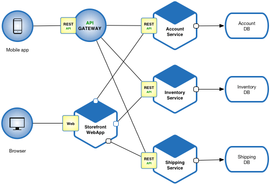
System architecture diagrams
- Purpose: Provide a high-level view of the system within its environment.
- Elements: The system (central box) and its external entities (actors, systems, users) are represented by other boxes around the central system box.
![]()
An example system architecture diagram for an ecommerce application (adapted from Source)


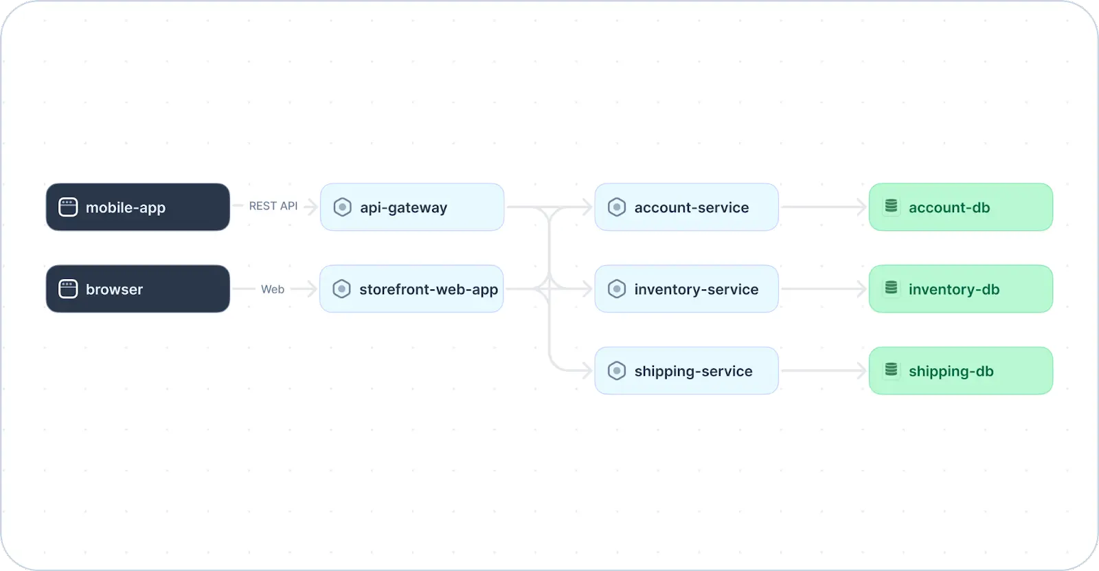
As you can see, the diagram above shows the high-level components of an ecommerce system. It does not provide granular details on each component’s implementation. Instead, it provides an overview of the system’s design as a whole and shows the relationships and interactions (via REST APIs) among a mobile application, API gateway, web application, and three separate microservices.
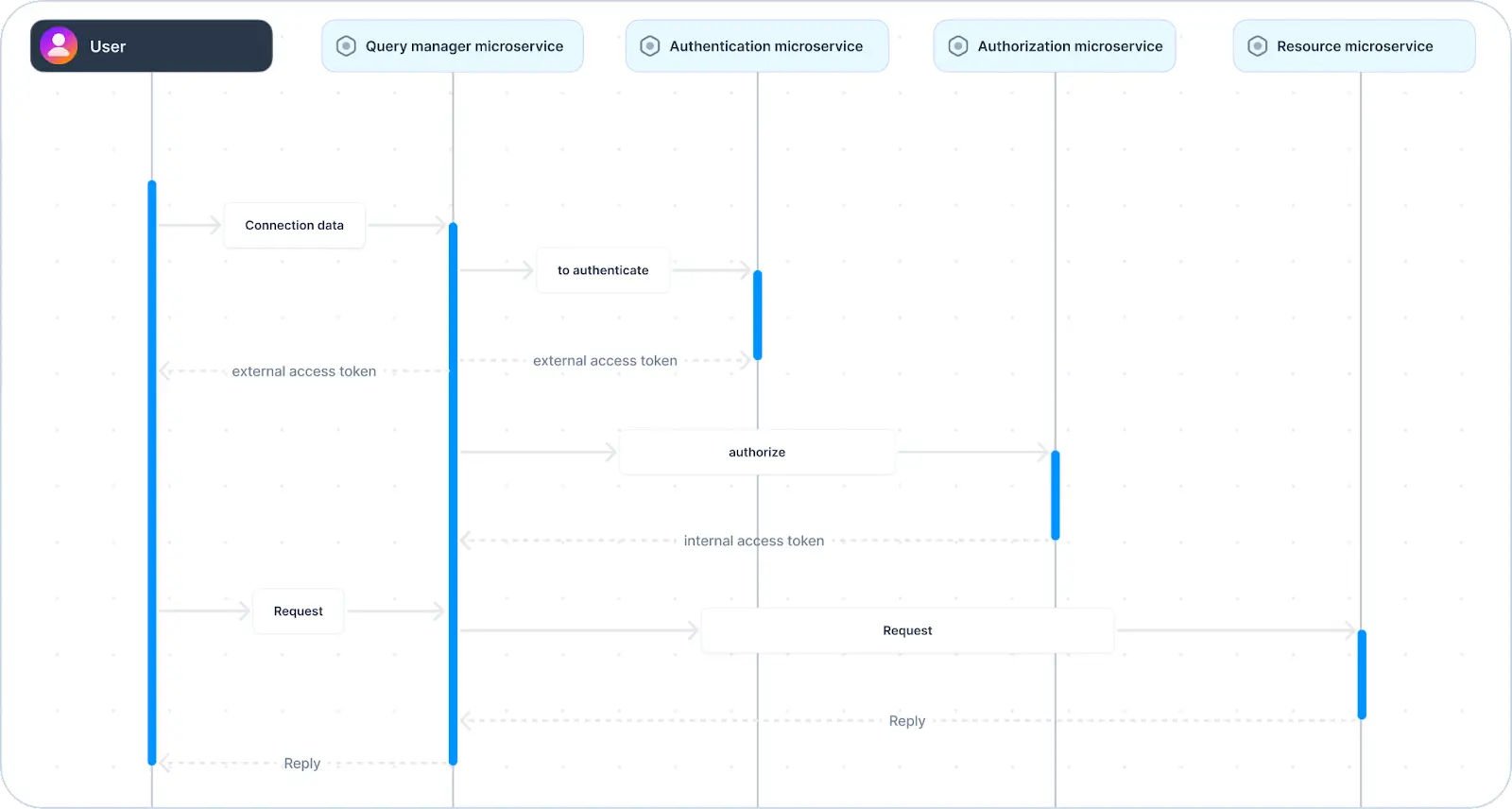
Sequence diagrams
- Purpose: Illustrate the interactions among components or objects over time.
- Elements: Lifelines (representing objects or components), messages among them, and control flow (illustrating the sequential flow of data).
![]()
Example sequence diagram showing a typical user authentication flow (adapted from Source)


Full-stack session recording
Learn more


In contrast to system architecture diagrams, sequence diagrams focus on a specific functionality. The sequence diagram above shows the order of interactions among four different microservices involved in handling queries, authenticating and authorizing users, and ultimately providing a requested resource to the authorized user.
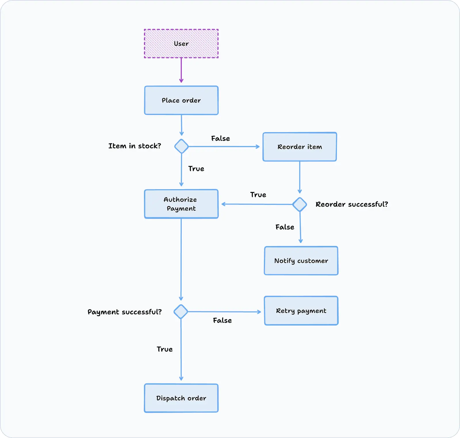
Activity diagrams
- Purpose: Visualize the workflow or business processes within the system.
- Elements: Activities (tasks or processes) and transitions among them.
![]()
An example activity diagram showing a customer order flow


Interact with full-stack session recordings to appreciate how they can help with debugging
EXPLORE THE SANDBOX(NO FORMS)
The activity diagram above illustrates the behavior of an ecommerce system as a whole. Rather than showing individual system components, it represents the flow of activities (represented by rounded boxes) that could take place within a system. It also shows control flow (via arrows) and includes decision nodes (diamonds) to illustrate where the flow can take different paths based on different conditions in the system.
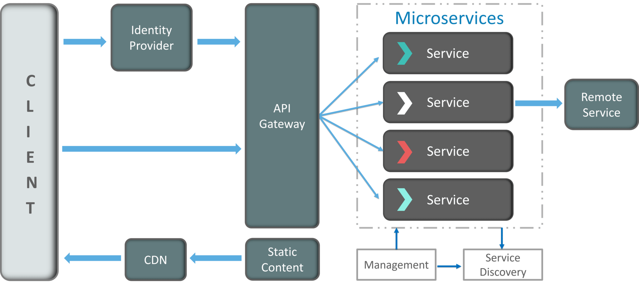
Network diagrams
- Purpose: Show how system components connect and communicate with one another.
- Elements: Objects and links representing interactions between different components within a network or system.

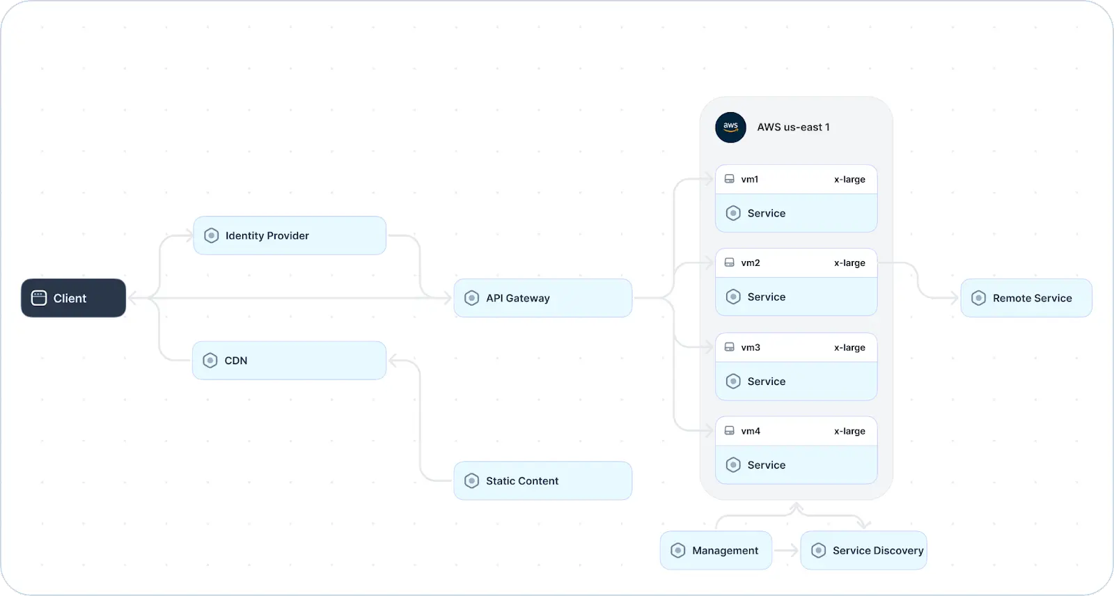
An example network diagram for a microservices architecture (adapted from Source)
The diagram above shows the primary components of a system from a networking perspective. It showcases the logical relationships and interactions between elements such as the content delivery network (CDN), API gateway, service registry, and container orchestration platform. Other elements to consider include the IP addresses and physical locations of different computing resources.
Break down the architecture into smaller, modular diagrams
Breaking down the architecture into smaller, modular diagrams helps manage complexity and allows for a more focused and detailed understanding of specific aspects of the system. This makes it easier for different stakeholders to understand and contribute to specific system areas.


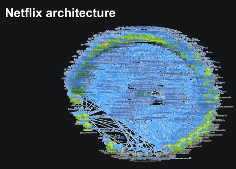
Actual representation of Netflix microservices architecture
The visualization above, referred to anecdotally as a “death star” diagram, shows what can happen in the absence of this approach. As you can see, the sheer number of components and the complexity of their relationships lead to an indecipherable diagram.
A microservice architecture can be divided into smaller, modular diagrams using various methods and approaches, including the following:
- Functional decomposition: In this approach, the system is broken down based on functional or business capabilities. Diagrammers can identify high-level functions or features of the system, create separate diagrams for each primary function or feature, and decompose each function into smaller, more detailed components.
- Component-based decomposition: This means dividing the system into modular components based on its architecture. This involves identifying key components within the system, creating separate diagrams for each major component, and (if necessary) further breaking down each component into subcomponents. Important relationships among different components should also be visualized when using this approach.
- Use-case-based decomposition: A more user-centric approach, use-case-based decomposition means considering a system from the perspective of a specific use case or user interaction. Separate diagrams for each use case or user story can be created and components involved in that functionality visualized in detail.
- Layered architecture decomposition: Systems are often described as having different layers, such as presentation, business logic, and data storage. Creating one or more separate diagrams for each layer allows diagrams to show each layer’s components in greater detail. In addition, important interactions between different components should be visualized.
One click. Full-stack visibility. All the data you need correlated in one session
RECORD A SESSION FOR FREEThe right approach depends on the specific characteristics of your system and the goals of your architectural documentation. It is also important to note that these methods can be combined.
Ideally, you want to create focused and manageable diagrams that collectively provide a comprehensive view of the system. Start by mapping major components, subsystems, APIs, and external dependencies. This process can be automated using a tool like Multiplayer, which integrates with OpenTelemetry to auto-generate architecture diagrams and summarize system information in its System Dashboard. Once system assets have been discovered, they can be filtered by different options–such as environment, source, target, protocol (HTTP, messaging, RPC), etc. - or decomposed into custom views for different stakeholders.


Multiplayer’s System Dashboard
Use effective diagramming approaches
Diagramming is a powerful tool for visualizing complex information and facilitating communication, but getting the most out of it requires using proper diagramming techniques. Approaches to diagramming can vary in effectiveness based on the context, purpose, and audience of the diagram. The tables below show effective and ineffective aspects of different diagramming approaches.
Remember that the value of a diagram depends on its alignment with the specific goals and audience of communication. Striking the right balance between simplicity and detail as well as clarity and visual appeal is critical to creating impactful and valuable diagrams.
Effective diagramming approaches
| Approach | Description |
|---|---|
| Hierarchy and layering | Employ a hierarchical structure and layering for complex systems. This allows viewers to focus on specific levels of detail, preventing overwhelming complexity. |
| Alignment and proximity | Align and group related elements to improve visual organization and make it easier to identify relationships between components. |
| Labels and annotations | Include informative labels and annotations to provide context and explanations, aiding understanding. |
| Use of color | Use color purposefully and consistently to highlight essential elements, relationships, or distinctions. Consistent color usage also maintains clarity. |
| White space | Allow for adequate white space to prevent visual clutter, making diagrams more readable and aesthetically pleasing. |
| Feedback and iteration | Seek feedback and iterate on diagrams for continuous improvement to help refine diagrams for better clarity and understanding and keep them up to date. |
| Audience consideration | Tailor diagrams to the audience’s level of expertise to ensure effective communication. |
Ineffective diagramming approaches
| Issue | Description |
|---|---|
| Overcrowding | Including too much information in a single diagram can overwhelm viewers and hinder comprehension. |
| Inconsistent notation | Using inconsistent symbols or notation can lead to confusion and misinterpretation. Establish and adhere to a precise notation scheme. |
| Ambiguity | Creating ambiguous or unclear diagrams can lead to misunderstandings among stakeholders. Ensure that the diagram’s message is clear and its level of abstraction matches the diagram’s intended purpose and audience. |
| Ignoring accessibility | Neglecting accessibility considerations may exclude individuals with visual impairments. Ensure compatibility with accessibility standards. |
| Over-reliance on color | Relying solely on color to convey important information may exclude individuals with color blindness. Use color as a supplement to other visual elements. |
| Lack of context or explanations | Failing to provide adequate context or explanations may cause viewers to struggle to understand the purpose or details of the diagram without sufficient context. |
| Ignoring feedback | Disregarding feedback or failing to iterate prevents improvement, leading to diagrams that are confusing or ineffective. |
Select appropriate tooling
Selecting the appropriate diagramming tool involves considering various criteria to ensure that it aligns with your specific needs and preferences. Here are some key criteria to consider:
- Ease of use: Look for a tool with an intuitive and user-friendly interface. Evaluate the learning curve to ensure that it matches your team’s proficiency level.
- Diagram types: Identify the diagrams you frequently create (system architecture diagrams, sequence diagrams, network diagrams, etc.). Choose a tool that supports the diagram types relevant to your needs.
- Templates and shapes: Assess the availability of templates and shapes relevant to your industry or use case. Also evaluate whether the tool has the flexibility to create custom templates and shapes if needed.
- Collaboration features: Check for real-time collaboration features if you work in a team. Evaluate version control, commenting, and sharing capabilities.
- Integration with other tools: Ensure compatibility and integration with other tools your team uses (e.g., Microsoft Office, Google Workspace, project management tools).
- Cost and licensing terms: Consider your budget constraints. Evaluate whether the tool offers a free version or trial period or if it operates on a subscription model.
- Export and import options: Check the ability to export diagrams in standard formats (PNG, PDF, etc.). Assess the ease of importing data or diagrams from other tools.
By carefully considering these criteria, you can choose a diagramming tool that best fits your requirements and enhances your productivity.
Stop coaxing your copilot. Feed it correlated session data that’s enriched and AI-ready.
START FOR FREELast thoughts
As independent and scalable components, microservices require a clear and comprehensive documentation method to convey their interactions. Diagramming plays a crucial role in documenting microservice architectures by visually representing the intricate structures and relationships within these complex systems.
Diagrams provide a visual language that facilitates understanding microservice dependencies, communication pathways, and overall architecture. They are invaluable documentation tools, helping developers, architects, and stakeholders understand the overall system architecture as well as its intricacies.
By breaking down a microservices architecture into modular diagrams, documenting specific aspects of the system, and employing standardized notations, microservices diagrams become essential references for onboarding new team members, debugging, and implementing changes. The clarity offered by well-crafted diagrams ensures effective communication, collaborative decision-making, and the establishment of a shared understanding of the microservices architecture among team members and stakeholders.